
Spring is in full swing, and the Clarity team has been hard at work improving the product to help you get even more out of your website analytics. This month’s updates are focused on making Clarity more intuitive, more useful, and easier to navigate. Let’s dive into what’s new!
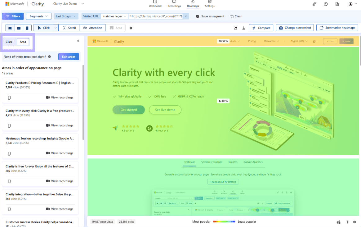
Area Maps Get a New Home and a Fresh Look
Based on your feedback, we’ve made some key improvements to Area Maps:
- New location: Area Maps are now located in the left panel within the Click Maps section. Since Area Maps are technically a type of Click Map, this update brings a more intuitive and organized experience. Note: You may temporarily see a disabled Area maps button in the old location. This is to help users learn the new location!
- Visual upgrades: We refreshed the color scheme to better align with Clarity’s branding.
- Improved data display: We’ve enhanced how percentage clicks are displayed, making it easier to understand engagement at a glance.
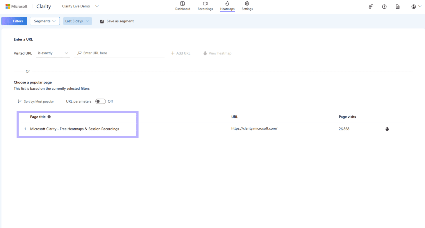
Page Titles Added to Heatmaps
Navigating heatmaps just got easier.
Now, when you’re browsing through the Heatmaps tab, you’ll see page titles displayed for each URL. This helps you quickly identify which page a recording is tied to—before you even click. This small addition can make a big difference when you’re deciding which page to analyze.
Clearer Recording Navigation: Watched vs. Unwatched
We’ve made it easier to navigate your Session Recordings with a new key update:
- Improved watched status: Recordings you’ve already watched now appear in a darker gray, so it’s easy to distinguish between what’s new and what you’ve already reviewed.
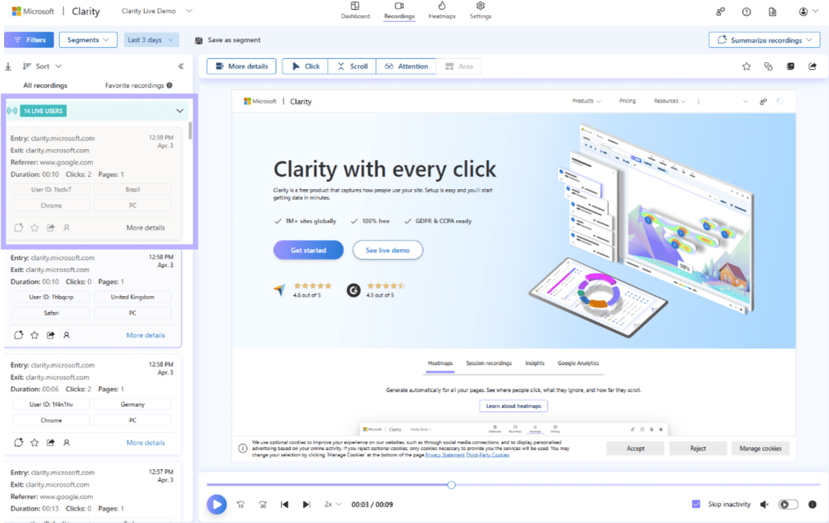
These updates are all about helping you find what you’re looking for—faster—and stay focused on the sessions that matter most.
Thanks for continuing to share your feedback with us! Every update we ship is inspired by real user input, so keep it coming. We’re excited for what’s ahead—stay tuned for more updates next month!