
Lesson 2 of 3By Avijeet Biswal
Power BI is an increasingly popular business intelligence and visualization tool from Microsoft that enables data analytics and data visualization. Ron George initially designed Power BI in the summer of 2010. The initial release was available for public download the following year. Power BI Desktop, Power BI Service, Power BI Gateway, Power BI Report Server, and Power BI Mobile Apps are the key components of the platform.
In this article, we’ll discuss the basics of Power BI Desktop and how to create a Power BI dashboard using Power BI Desktop. Then, we’ll publish this dashboard on Power BI Service.
Microsoft’s Power BI is a business and data analytics service that enables professionals to process, analyze, and visualize vast volumes of data. It helps extract insights, draw conclusions, and share results in the form of reports and dashboards across various departments. It provides an easy drag and drops feature with a range of interactive data visualizations to generate reports and dashboards.
Power BI dashboards are single-page documents, often referred to as canvas, which illustrate a story through visualizations. A well-designed dashboard consists only of the highlights of a story. This is due to the fact that it is limited to one page. For more information, readers can view related reports. Power BI is the only service that offers dashboards.
A single page visualization with multiple charts and graphs to tell a story is called a Power BI dashboard. This one-page visualization in a dashboard is also known as a Canvas. The Power BI dashboard is a feature only available in Power BI Service. Since a Power BI dashboard is limited to one page, it only contains the highlights of a story. You cannot create a dashboard on Power BI Desktop.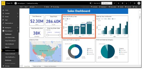
Fig: Power BI Dashboard on Power BI Service
In a dashboard, visualizations are generated from reports, and each report is based on one dataset. The visualizations present on the dashboard are called tiles, and report designers pin these tiles to the dashboard.
Capability
Dashboards
Reports
Pages
Has only one page
Has one or more pages
Data Sources
Contains one or more reports and one or more datasets per dashboard
Contains a single dataset per report
Filtering
It can’t filter or slice the view
It can filter, highlight and slice the view in various ways
Availability on Power BI Desktop
Dashboards are not available in Power BI Desktop
Can create reports on Power BI Desktop
Featured
You can set one dashboard as your "featured" dashboard
Cannot create a featured report
Building reports on Power BI Desktop and publishing them to Power BI Service is one of the best ways to understand how a Power BI dashboard works.
For our demo, we’ll be looking at a sales dataset that contains product sales information throughout the United States. The dataset contains various customer-related details, including customer names, order and shipment dates, product names, product categories and subcategories, profit made, and so on. This dataset is commonly known as a Sample Superstore dataset. We’ll analyze this dataset to compare sales and profit from each segment, year, and quarter.
We’ll also create a map to show the sales across different states in the USA.
The following is the dataset that we’ll be using to create the dashboard: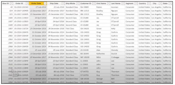
Fig: Sales Data
First, we will create three separate cards to calculate the total sales, profit, and quantity sold. From the visualization panel on the right, click on “card,” which will create an empty card.
Drag the sales column on to the fields, which will give you the total amount of sales of all products. You can edit this card by changing the font size and the color of the sales value. Also, you can add a title to this card. Similarly, you can create two more cards for total profit and total quantity sold by dragging respective columns on to fields.
After that, we’ll add a slicer to our visualization to slice the data based on the “Order Date” column. This will help us filter the data and view it according to the need.
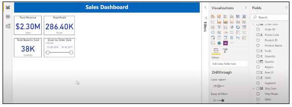
Fig: Cards and Slicers
Suppose you are looking to visualize and analyze sales and profit over a certain number of years. In order to do this, you’ll create a line and stacked column chart. Select the line and stacked column chart from the visualization panel and drag the “Order Date” column on to “Shared Axis.” Put “Sales” under “Column” values, and insert the “Profit” column into “Line” values. That will generate the graph. You can edit the color of the bars and the line under the format tab.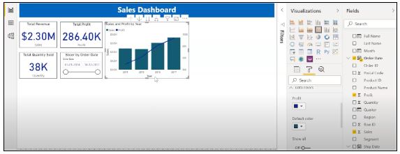
In the chart above, the bars represent the sales, and the line represents the profit. The graph reveals that the highest amount of sales and profit occurred in 2017.
Power BI Desktop provides an excellent feature to drill down into the data and visualize the graph in terms of each quarter, month, and day. This option is available at the top when you navigate to a specific chart.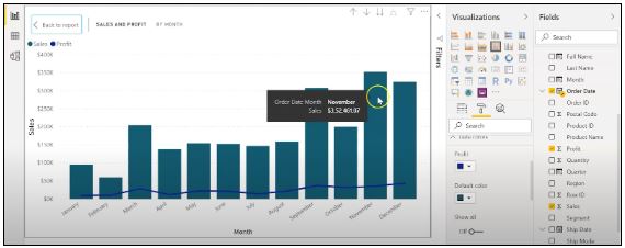
Fig: Sales and profit by each month
From the visualization above, we can see that November had the most sales.
You can also add the labels to the graph by clicking the “Format” tab and switching on the data labels.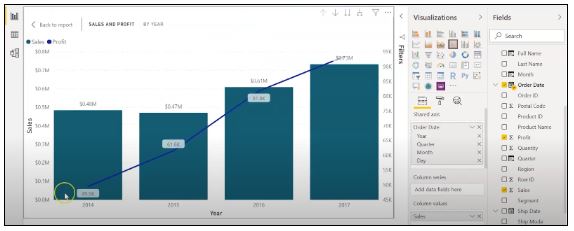
Fig: Adding labels to the graph
Now, let’s create a clustered column chart by analyzing annual and quarterly sales.
From the Visualizations menu, select the “Clustered Column Chart.” Add the “Year” column onto the axis. Take the “Quarter” columns under “Legend,” and add the “Sales” columns to “Value.”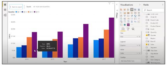
Fig: The clustered bar chart
The graph above shows that the first quarter of every year had the lowest sales numbers, while the fourth quarter was consistently the highest. You also have the option to change the colors on your graph to make it more visually appealing.
Now, let’s analyze the sales for each state in the US. To do this, we’ll use a filled map. Select a filled map from the visualizations panel. Add the “State” column to “Location.” Drag the “Sales” column onto “Tooltips.” To edit the colors, click on the “Format” tab, and choose “Data Colors.” Select the conditional formatting option and add the range of colors that you’d like. 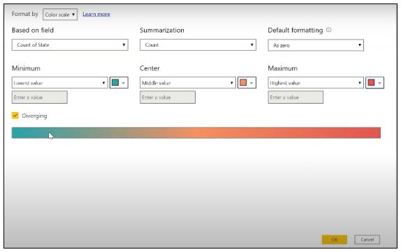
Fig: Formatting colors based on the sales
We have defined our color scheme for the lowest, middle, and highest sales values. The states colored green made the lowest amount of sales. The states marked in orange or red, which are California, Texas, and New York, made the highest amount of sales. Similarly, you can also build a map to see the profit and the units that each state sold.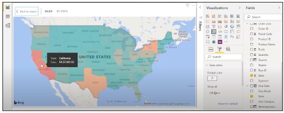
Fig: Sales by each State
The following is what our report looks like so far. We have gone over creating cards, slicers, line and clustered column charts, clustered bar charts, and filled maps. 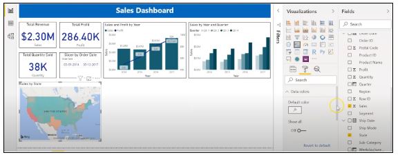
Fig: Sales report
Next, let’s look at how to create a donut chart to analyze sales and profit by segment.
Under visualizations, click on the donut chart. Under legend, add the segment column. Drag the “Sales” column on to “Values” and “Profit” on to “Tooltips.”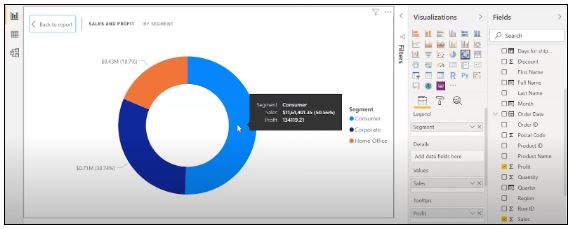
Fig: Donut chart for Sales and Profit
The donut chart above indicates that the consumer segment had the highest amount of sales and profit, while the home office segment had the lowest. You can format the visualization as per your requirements to make it more visually attractive.
Now, we’ll move on to creating a pie chart, which will enable us to visualize the sales for each product category. Move the “Category” column on to “Legend” and add the “Profit” column under “Values.” Drag the “Sales” column on to “Tooltips.”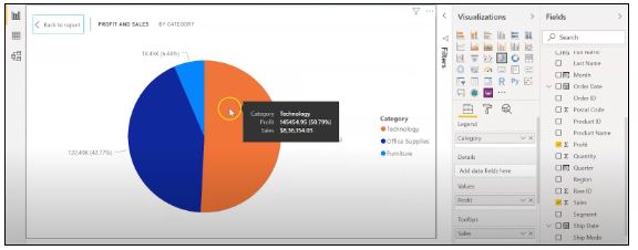
Fig: Pie Chart for Profit and Sales
The technology category generated the highest amount of sales and profit, while furniture made the lowest. The “format” tab is used to change the colors and make any necessary edits.
The following is what the final overall sales report will look like: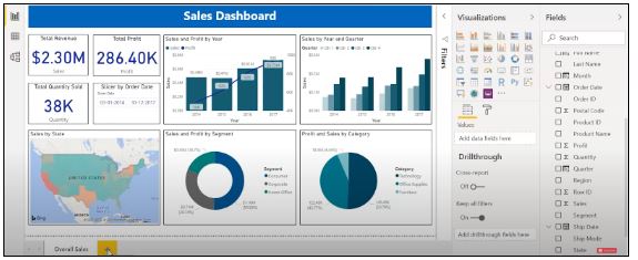
Fig: Overall Sales Report
Let us now visualize our data at a more granular level by analyzing sales, profit, and units sold at regional and state levels.
First, we’ll create three slicers to filter our data. Click on the slicer from the visualizations panel and add the “Region” column on to “Field” to create a regional slicer. Similarly, you can create a state and year slicer. You also have the option to edit the slicers to change the font size, increase the size of the text, and add a background color.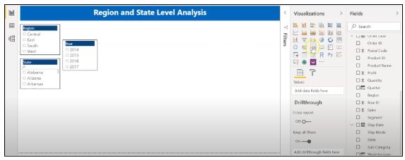
Fig: Slicers to filter data
We’ll now create a table to check the quantity and the profit made in each city. Under the “Visualizations” tab, select “Table”. Add the “City” column under “Values,” followed by quantity and the “Profit” column. Add a background color to the column headers and increase the size of the font. You can filter the data by selecting the items from each of the slicers.
Below, we have selected the central region and selected the state of Minnesota. In the table, you can see all the cities in the state of Minnesota, the quantity sold, and the profit they made.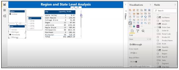
Fig: Creating a Table in Power BI
Sorting a table is another capability that Power BI Desktop supports. This gives users the option to sort the column in a table in their order of preference.
Now, let’s build a clustered bar chart to analyze the sales for each product category across different states. Select the clustered bar chart from the visualizations panel. Take the “State” column on the axis, “Category “columns on to the legend, and “Sales” on to “Value.”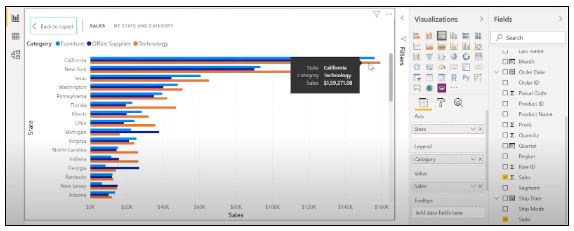
Fig: Clustered Bar Chart
Among the three categories of products, the state of California made the highest sales for all categories.
Next, let’s verify the annual profit by category using an area chart. Select the area chart from visualizations and drag the “Year” column on to the axis, the “Category” column on to the legend, and “Profit” on to “Values.”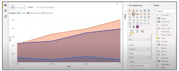
Fig: Area chart using Power BI
You can analyze the profit and quantity that each product category and subcategory sold. You can also create a funnel. Users can explore their many options through the dashboard.
The following is what our report for the region and state-level analysis will look like::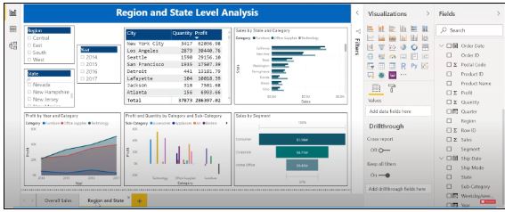
Fig: Region and State Level Report
If you want to go in detail and create a more granular level report, you can do that by creating a report based on the products’ categories and subcategories, as shown in the report below. You can use category and subcategory as your slicers and create different line charts, bubble charts, treemaps, and pie charts to visualize the data.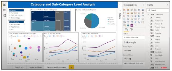
Fig: Category and subcategory Level Report
We’ll now publish our overall sales report on Power BI Service and create a dashboard.
Save your reports on Power BI Desktop. Then, click on the home menu and select the “Publish” button.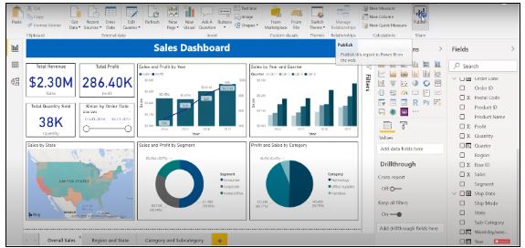
Fig: Publishing report on to Power BI Service
You can also create a new workspace or publish the report to an existing workspace in Power BI Service. 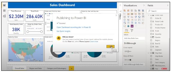
Fig; Publishing to Power BI successfully
Let us now explore the different Power BI Service features and build a dashboard.
To access Power BI Service, log in to app.powerbi.com and give your Microsoft account credentials. Under “Workspaces,” you can view all of your published reports.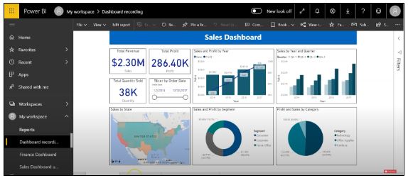
Fig: Power BI Dashboard on Power BI Service
To create a Power BI dashboard, you need to pin each of the visualizations individually. The pin button appears on top once you click on a visualization. It will ask whether you want to pin it to an existing dashboard or create a new dashboard. Choose whichever is suitable.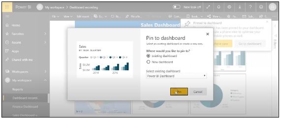
Fig: Pinning tiles to the Power BI Dashboard
If you go to your dashboard name and select it, you’ll find all the visualizations that were pinned from the reports. You can resize the tiles as you wish to make them fit better.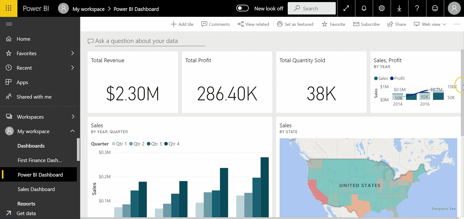
Fig: Power BI Dashboard using sales data
Power BI Service has a helpful feature that enables users to ask questions about their data and receive insights. Let’s see how Power BI can automatically provide insightful information about your data.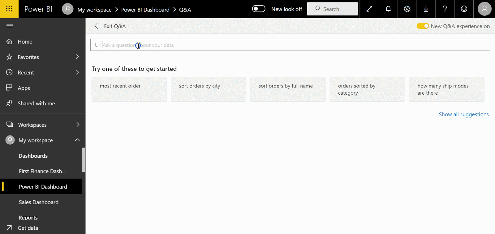
Fig: Asking questions using Power BI Dashboard
Power BI is an exceptionally powerful business intelligence tool used to analyze and visualize data. We created this guide to introduce Power BI to anyone looking to learn more about this tool, as well as Power BI Desktop and its many features. We also covered Power BI dashboards, which included a step-by-step demo for creating a Power BI dashboard using Power BI Desktop and Power BI Service. Finally, we explored the various Power BI Service features and derived meaningful insights from our data.
If you have any additional questions or would like to learn more about Power BI, please leave a comment in the chat section.
Start your career as a Data Analyst by learning through 20+ industry-relevant Data Analytics projects. Enroll in Simplilearn’s Data Analyst Master’s Program to get started!
In today’s world, if your company isn’t taking a data-driven approach to all aspects of the business, it will fall behind others that do. That’s why professionals in the field of data and business analytics are in such high demand. If you’re looking to kickstart your career in this exciting field check out our Data Analyst today. We also offer a comprehensive collection of courses in all things data science and AI to get our learners up to speed on the latest and greatest technologies, tools, and best practices.
Avijeet is a Senior Research Analyst at Simplilearn. Passionate about Data Analytics, Machine Learning, and Deep Learning, Avijeet is also interested in politics, cricket, and football.
The Best Introduction to Data Science
Data Science Career Guide: A Comprehensive Playbook To Becoming A Data Scientist
Best Data Science Books for an Aspiring Data Scientist
Data Science Salary Report
How to Become a Data Scientist?
Data Science Interview Guide
© 2009 –2023– Simplilearn Solutions
Follow us!
Company
Work with us
Discover
For Businesses
Learn On the Go!
Trending Post Graduate Programs
Trending Master Programs
Trending Courses
Trending Categories
Trending Resources